
Resources
How to Make AI-Generated Slides That Don't Look Like AI Slop
AI can generate slides in minutes, but the results share a recognizable look. Here are the four most common AI slop patterns in slide design and how to fix each one.

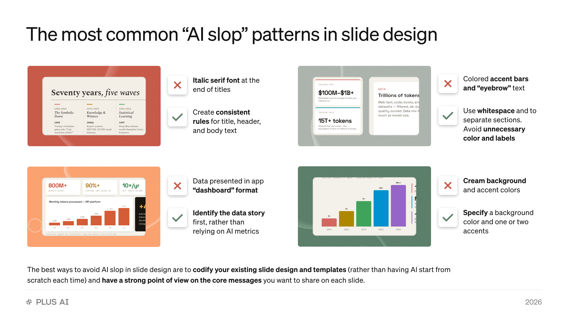
If em dashes are the tell of AI-generated writing, then cream backgrounds, italic serif flourishes, and colored bars next to every text box are the tells of AI slide design.
These design choices aren’t horrible on their own. The problem is when Claude, ChatGPT, and other AI tools all make the same choices on every deck, for every company, for every audience. Once your audience has seen a few AI-generated presentations, they turn into a sign that nobody spent much time on this slide.
The good news is that AI slop isn’t a limitation of the AI. It’s just what the model defaults to when you don’t give it clear design direction. I’ve generated hundreds of decks with Claude, ChatGPT, and purpose-built tools like Plus AI, and the same few patterns account for most of the “this was made by AI” feel.
In this post, I’ll walk through the four most common AI slop patterns in slide design, how to fix each one, and the two changes that eliminate slop at the source.
Pattern 1: The italic serif font at the end of titles
The tell: Titles like “Seventy years, five waves” — a sans-serif opening with an italicized serif phrase tacked on the end. It’s Claude’s signature typographic flourish, and it shows up on website headers, title slides, section headers, and body slides alike. The first time you see it, it looks elegant. The tenth time, it looks like an AI watermark.
The fix: Create consistent rules for title, header, and body text. Use the same rules for type on every slide. Decide the font family, size, and weight for each text level and hold the AI to it. If you’re prompting a chatbot, say so explicitly (“titles in a single font and weight; no italic or serif flourishes”). If you’re using a template-driven tool, the slide master enforces this for you, and the flourish never appears.
Pattern 2: Colored accent bars and “eyebrow” text
The tell: Every content block gets a tiny colored bar on top or on the side, along with an all-caps mini-label (“TRAINING COST,” “DATA”) before the actual heading or title. It’s extraneous decoration doing the job that layout should do. When every card on every slide carries a colored bar and an eyebrow, it becomes AI gibberish. If the accents arrive in a different color on every slide, it can also turn a two-color deck into a messy six-color one.
The fix: Use whitespace to separate sections, and avoid unnecessary color and labels. A well-spaced slide doesn’t need a colored bar to show where one idea ends and the next begins. Strip the eyebrow text unless the label genuinely adds information the heading doesn’t. As a rule of thumb: if you delete the decoration and the slide is just as clear, the decoration was slop. If you do want to include “Chapter” or section tags on your slides, make sure they are part of your template, so the AI uses the tags the way you want to use them.
Pattern 3: Data presented in app “dashboard” format
The tell: A slide that looks like a product analytics screen with a row of oversized stat tiles. AI loves creating slides that look like website or app screens. But a dashboard is built for monitoring, not persuading. It presents six numbers with equal weight and lets the audience guess which one matters.
The fix: Identify the data story first, rather than letting the AI pick metrics that format nicely. Before you generate the slide, decide the one thing the numbers need to prove — then build the slide around that claim, with a single chart or figure as the evidence. “Usage is compounding: tokens processed have doubled every year since 2023” is a slide. Six KPI tiles is a screenshot.
This is also where fabrication creeps in: dashboard-style slides invite the AI to fill tiles with plausible round numbers. Always supply the actual data, and insist on native, editable charts rather than images of charts. Plus AI generates fully editable charts, so the numbers stay updatable and verifiable.
Pattern 4: The cream background and default accent colors
The tell: The warm cream canvas with muted red accents. It’s a nice palette — just like Claude! It’s also the same palette on every AI-generated deck, and it probably doesn’t match your company’s brand. When your quarterly review, your competitor’s pitch, and a student’s homework all share a color scheme, the color scheme becomes a tell.
The fix: Specify a background color and one or two accents, and don’t let the AI improvise beyond them. The best source is your existing brand: your background, your primary accent, one secondary. If you have no brand guidelines, pick deliberately anyway — a stated palette of three colors will always look more designed than a default palette of six.
The two fixes that actually work
You can chase the four patterns individually with prompt instructions — and it helps. A reusable blocklist like this one is worth saving as a Claude skill or project instruction:
Titles, headers, and body text follow one consistent type treatment — no italic serif flourishes. No eyebrow labels or accent bars; use whitespace to separate sections. One background color and at most two accent colors. No dashboard-style stat tiles — every data slide makes a single point, with real data in an editable chart.
But prompt patches only treat symptoms, not the underlying issues. For example, if you tell AI to avoid “vibe-coded” colors or “AI slop,” it just pushes the AI from its first choice (which used to be dark-colored pages with bright green accents) to its next choice (beige backgrounds with bright accents).
The two changes that actually eliminate AI slop at the source are:
1. Codify your existing slide design and templates
Every slop pattern above comes from the same root cause: the AI is designing from scratch, so it falls back on its defaults. Don’t let it start from scratch. Use a tool to automatically turn your existing deck design (fonts, colors, logo placement, layouts) into a template, and make the AI generate into it.
With a chatbot, this is possible but unreliable. In my testing of Claude for PowerPoint, it repeatedly failed to apply my template across a full deck, and fixing fonts and colors slide-by-slide burned both time and usage limits.
Purpose-built tools enforce the template at the rendering level instead: Plus AI generates decks from custom themes and branded templates, and for enterprise teams it builds on your actual slide masters — so consistent typography, your palette, and your layouts are how the slides are constructed, not something you have to re-request.
2. Have a strong point of view on the core messages
Design fixes can’t save a deck with nothing to say. The dashboard problem in particular is a content problem. The AI just reaches for generic metric tiles and a selection of different numbers because you haven’t told it what the argument is.
Before you prompt, write one sentence per slide — the one thing the audience should remember. Then give the AI your source material: a strategy memo, the actual spreadsheet, the product one-pager. Plus AI accepts PDF, Word, and PowerPoint uploads and turns them directly into a deck, which means the slides organize your argument and your data instead of inventing filler.
Compare “make me a sales deck” with “make a 10-slide sales deck for a CFO evaluating expense software; the goal is a pilot commitment; lead with the 12 hours per month their team loses to manual reconciliation.” The second prompt produces a deck that sounds like you and is less likely to use slop filler.
A quick anti-slop checklist
Before you present an AI-generated deck, scan for the four patterns:
- Titles, headers, and body text follow one consistent type treatment — no italic serif flourishes
- No accent bars or eyebrow labels standing in for real hierarchy; sections separated by whitespace
- Every data slide makes one point, with real numbers in an editable chart — no dashboard tiles
- One deliberate background color and one or two accents, ideally from your brand
And the two root-cause questions:
- Did the AI generate into your codified template, or design from scratch?
- Did you decide the core message of each slide, or did the AI?
If you can answer those last two the right way, the four patterns mostly never appear in the first place.
Make AI slides that look designed, not generated
AI slop is what you get when the model fills in everything you didn’t specify with its defaults. Codify your slide design so the AI can’t improvise it, and bring a strong point of view on what each slide needs to say, and AI becomes what it should be: the fastest way to a deck that looks like your team made it.
Plus AI builds both fixes into the product: native, fully editable presentations in Google Slides and PowerPoint, generated from professional templates or your own branding.
Try Plus AI free for seven days and see the difference between slides that look generated and slides that look designed.