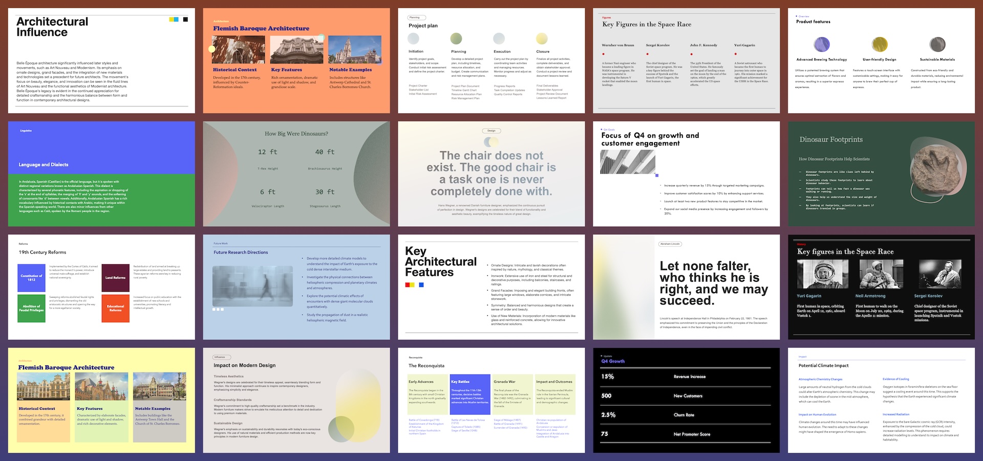
Designing PowerPoint presentations is hard! Even if you’re a great communicator, you might feel out of your element when trying to create slides that need to be clear, effective, and beautiful.
Slide design require practice and mastery over a set of graphic design foundations, like content hierarchy, visual layout, typography, and color theory. But even if you’re not a professional designer, don’t worry.
Here are some guiding principles to help you make polished and professional PowerPoint presentations, without a graphic design degree.
{toc}
Start with an outline
If you’re reading this, you’re probably not a professional slide designer. And I hate to break it to you, but reading this blog post isn’t going to turn you into one. So our first piece of advice is that you should spend 80% of your time on the content, and less than 20% of your time trying to make slides that look good.
A well-structured presentation with coherent messages and minimal styling is far more effective than one that looks beautiful but doesn’t know what it wants to say.
Before you even open your PowerPoint app, plan out your content. Ask yourself:
- What is the goal of the presentation? To inform? To persuade? To spark discussion?
- Who is the audience? What is the voice and tone?
- Is the presentation a visual aid for a speaker or is it meant to be consumed independently by a reader?
- What are the key messages the audience should walk away with? What data and visual aids would support those key messages?
Write your answers down. Then create a presentation outline with a list of slides titles. We recommend writing titles as descriptive sentences, like “Strong revenue growth is driven by channel expansion”, rather than single word or phrases like “Revenue growth”.
Next, think through the key supporting points under each slide, and whether there is a visual aid you want to add (e.g., data table, chart, diagram, illustration, etc.)
If this sounds like a lot of work, that’s because it is! Planning probably takes longer than you think.
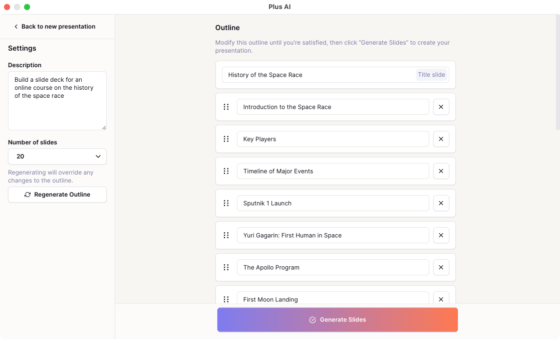
By the way, if you need a last-minute presentation, try using an AI PowerPoint maker like Plus AI. Plus AI will always help you create an outline first, to mirror the way you should approach making a presentation.
Use a template
If you don’t want to worry about designing PowerPoint slides at all, consider using a professionally-designed template instead.
Static PowerPoint templates
There are lots of free resources for downloadable PowerPoint templates. (You have probably seen the built-in PowerPoint templates, or maybe you have a corporate template you are supposed to use.)
When selecting a template, look for one that has a wide variety of layouts, matches the visual style you are going for, and roughly matches the information density you need. Avoid templates that only have a few slide types or layouts, even if they look great, because you’ll waste a lot of time trying to force your content to fit the existing designs. (In fact, this is a common problem we see with corporate branded templates.)
If you’ve done the prep work to create a strong presentation outline, it should be relatively straightforward to select a layout from the template and fill in the content you planned.
Plus AI templates
Plus AI gives you the best of both worlds of starting from scratch and using a template. Plus can generate a presentation for you from any prompt, so you don’t need to stare at a blank sheet of paper or be constrained by the exact structure of an off the shelf template.
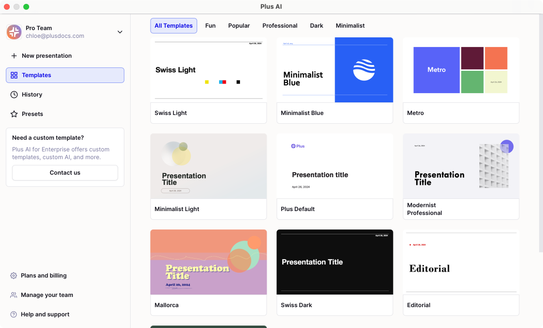
Within Plus, you can select from a number of professional-designed templates that are all AI-enabled, to quickly generate a first draft of professionally-designed slides in just a couple of minutes.
{cta}
5 principles of PowerPoint slide design
Even if you have a template or use AI to create a first draft, you might still want to be able to design new slides — for example, because the content you planned doesn’t exactly match the options that are available. Or maybe because your company-provided presentation “template” is really just a set of colors and logos on an empty canvas.
Here are some basic principles of slide design to help you become comfortable with modifying PowerPoint templates or creating your own designs from scratch.
Rule 1: Use a grid layout
Most slides follow the same basic content pattern. There is a title (maybe a subtitle or chapter header) and some content sections.
In general you should make sure:
- Page margins are large enough and consistent across slides
- Consistent elements (like the location and size of the title) are consistent across slides
- Content sections are laid out on a grid — i.e., they are aligned and evenly spaced.
For example, if you have a slide about three types of dinosaurs, your might have a title and three content sections, each with an image, a header, and some bullets.
If you find your planned content doesn’t fit neatly on a grid, it might be a sign that you’ve tried to cram too many messages onto a single slide. Try breaking up your planned content into 2 or 3 slides instead!
.png)
Rule 2: Keep font sizes (and styles) consistent
One of the most common mistakes for amateur slide designers is using too many font sizes on a page. Font size and weight (e.g., “bold”) help establish content hierarchy. At a glance, the audience should be able to identify the slide title, section headers, and detail text. When you use too many font sizes on a slide, the reader’s eye is overwhelmed and doesn’t know where to focus.
Here are some rules for fonts and type:
- The title should be visually distinct (e.g., larger, bolder) from the rest of the content
- Section headers should be visually distinct and clearly connected to the supporting detail
- Line heights are consistent across slides
- There is space between bullets, paragraphs, and sections
Also, as much as possible, font sizes and styles should be consistent across all of your slides in a presentation. We recommend choosing one set of styles (size, boldness, line height and spacing) for your title, section headers, and body text, and using them across your entire slide deck.
If you need to shrink text to get it to fit on a slide, do it consistently across all of the body text on the slide, so that the visual hierarchy is still clear.
%2520(1).png)
Rule 3: Choose a color palette and stick to it
We recommend using the theme color palette in PowerPoint (go to Design > Variants > Colors > Customize Colors) to set your color palette.
If your goal is to make a professional-looking presentation, stick to a limited color palette. Choose a light background color (white is totally fine) and a dark primary text color. Pick 2-3 accent colors that you use sparingly throughout. If you have a set of corporate brand guidelines, work off of those colors, but make sure your background and primary text color have enough contrast to be legible.
Here are some examples of "professional" slides that use color effectively, even though they all use dark text on a light background and blue as an accent color.
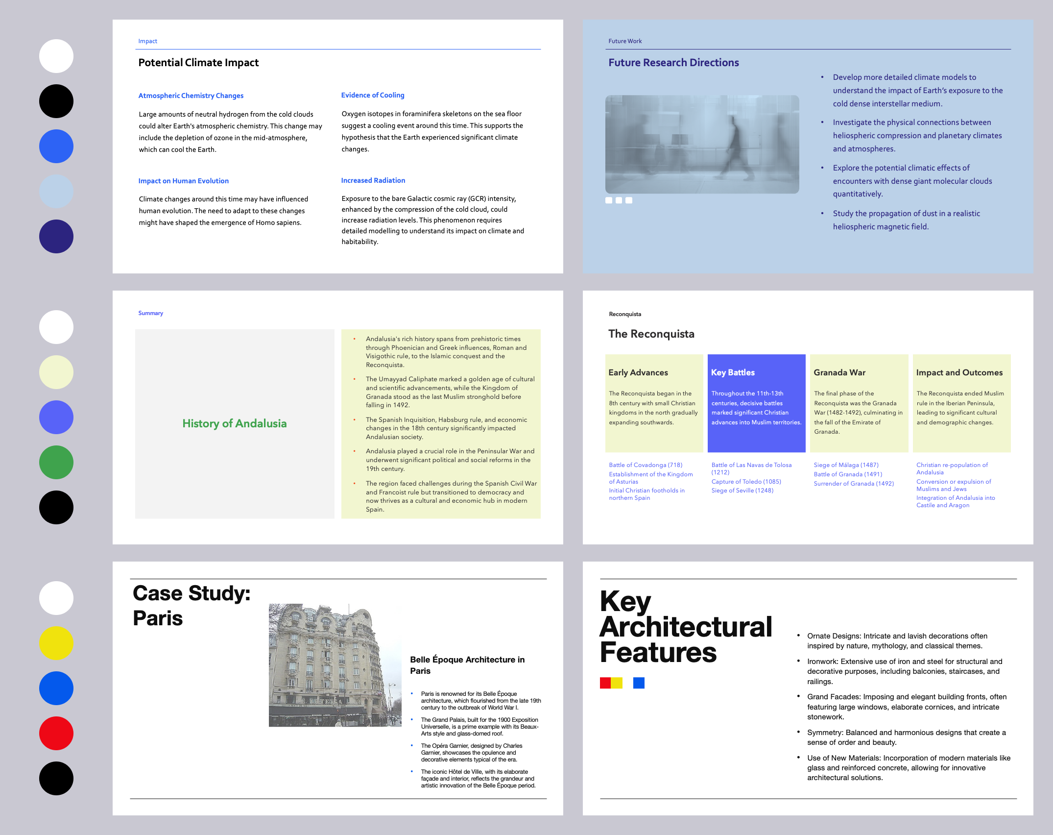
If your goal is to make a presentation that stands out, playing around with color is one of the easiest ways to achieve a more distinct visual look. For inspiration, look at other PowerPoint designs you like (we think our templates are pretty good) and other sources of good graphic design, like websites and advertisements. You can also use tools like Coolors.co to generate color palettes quickly.
Remember that sometimes less is more, especially with bold colors. You can achieve an eye-catching effect with just a couple of colors.
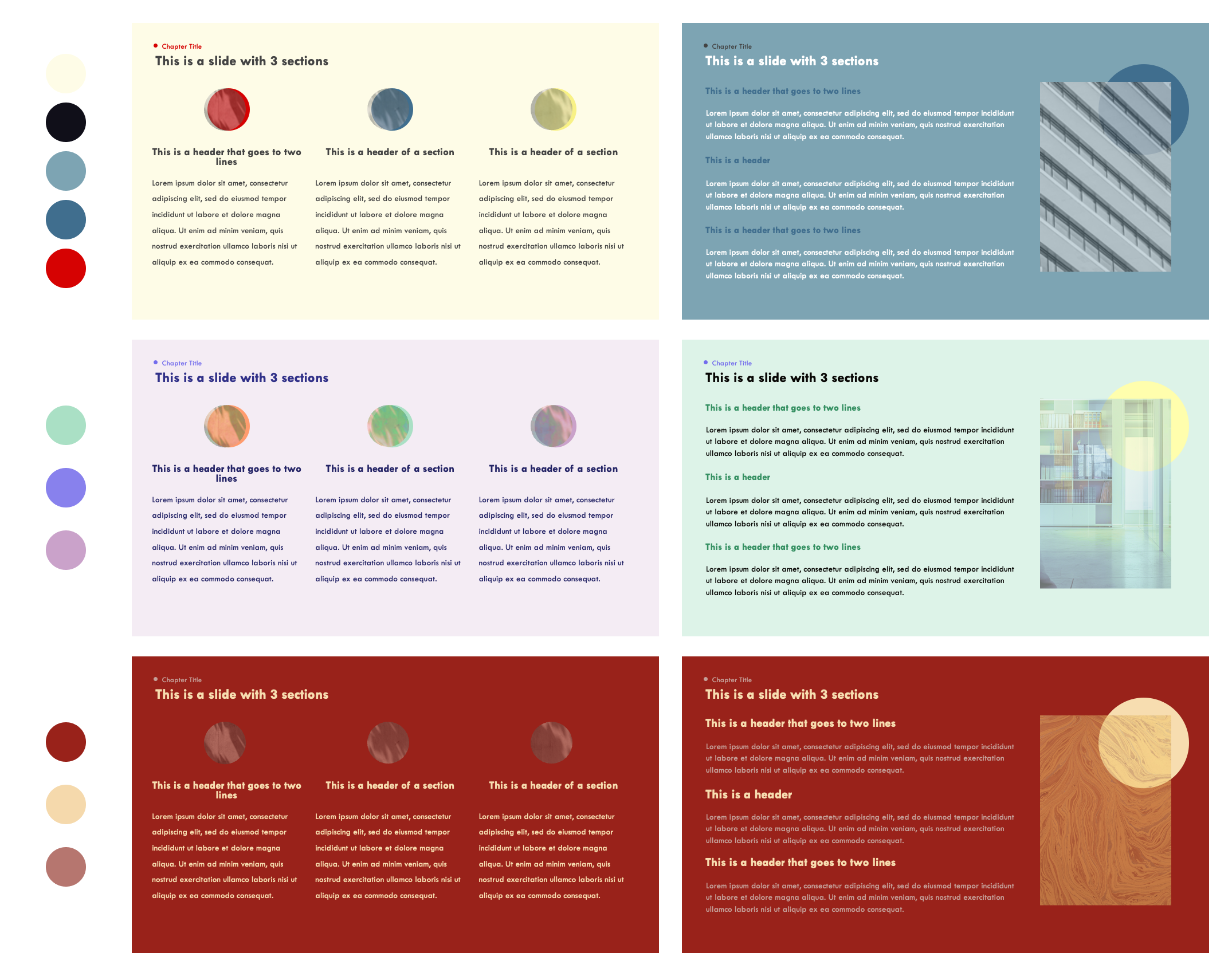
Here are some examples of more distinct color palettes. Notice how changing the color scheme of these slides really affects their look and feel, even though they are exactly the same designs. The last set of slides is also a good example of how to use fewer, bolder colors.
Rule 4: Play with typography
Typography plays a central role in establishing a visual style for your PowerPoint presentation, especially if your content is text-heavy.
If you have to follow a set of corporate brand guidelines, sorry, you should stick to the rules. You can still use layout and graphic elements to spruce up your presentation.
If you have the freedom to choose your own font(s), here are some suggestions:
- Stick to one or two fonts. For professional presentations, we recommend one. For more visually distinct presentations, choose two contrasting fonts — one for titles and headers and one for body text.
- Even if you are sticking to one font family for all the text in your presentation, you can use different weights (e.g., bold) for titles and body text.
- You can also play around with other text styles (like all caps) to distinguish your headers and body text.
- It probably goes without saying, but you should make sure your text is legible.
- A note about selecting fonts in PowerPoint — fonts in PowerPoint can be complicated if you’re planning on collaborating with others and they need to be able to edit the text directly. Be careful with embedding custom fonts — it can cause problems. If you’re planning on distributing your PowerPoint around to other editors, stick to “cloud fonts” (available to all Microsoft 365 subscribers) or legacy fonts (e.g., Arial, Calibri, Century Gothic, Franklin Gothic Book, Georgia, Times New Roman). For a more detailed guide to font selection in PowerPoint, refer to this guide.
- If you use custom fonts in your presentation, we recommend distributing the PowerPoint as a PDF to make sure it looks exactly as you intended to the reader.
Here are some example font combinations in PowerPoint that utilize Cloud Fonts, which should be available on all recent versions of PowerPoint. Notice that we vary font styles and weights to add visual interest and create a sense of information hierarchy.
.png)
Rule 5: Add graphic elements
It's probably obvious that adding images to your presentation will add visual interest. If images (or charts, tables, graphics) can serve as supporting data for your presentation content, feel free to use them liberally. Remember that the rules of layout are the same for text and image-based content, e.g.,
- Your images and graphics should sit on the same grid system as your text
- Make sure there is enough white space around the image. You can also crop them to a shape to add visual interest or mirror other graphic elements on your slide.
- Photos should be high-enough resolution (depending on how they will be viewed by the reader)
- Charts and tables should be clearly labeled so the reader can understand them
.png)
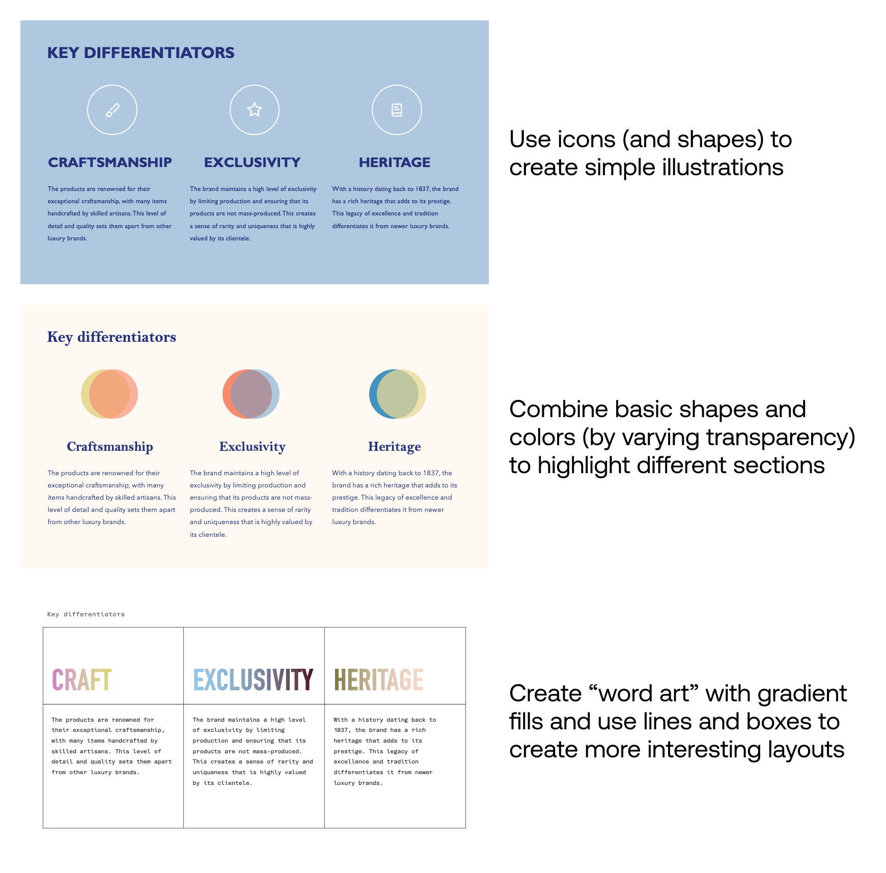
But what if you don’t have any readily available or appropriate graphics? Or your presentation’s content doesn’t naturally support illustrations? You can still add decorative graphic elements that don’t convey critical meaning, but do still support your presentation’s messaging and add visual appeal. For example:
- Adding shapes and outlines to highlight certain pieces of content (headers, takeaways)
- Using basic built-in PowerPoint shapes to create simple illustrations or infographics
- Including icons to illustrate each section of a text-heavy slide
- Adding an overlay to an image to bring in your theme colors
- Using fill colors and gradients on your existing text elements to add visual interest
Free resources for slide design
Here are some of our favorite free design resources. Make sure you check the license and usage rules and give credit to designers when needed.
- Photos: unsplash.com, pexels.com
- Icons: thenounproject, lucide.dev
- Cloud Fonts: https://designtopresent.com/2024/06/20/a-guide-to-cloud-fonts-in-microsoft-office-365/
- Colors: coolors, colorhunt.co
- Inspiration: awwwards.com, siteinspire.com
Conclusion
Creating effective presentations is an incredibly valuable skill - just ask the experts at companies like McKinsey and BCG. No one becomes a world-class slide designer overnight, but hopefully these rules and design principles will help you practice and build a foundation for creating better presentations over time.
Last but not least, if you'd like a quick way to get a well-designed presentation, check out our guide to the best AI presentation generators, which can generate a new PowerPoint for you in minutes.
