
One of the best ways to showcase data in a presentation is to use a chart. Using PowerPoint, you can insert and customize a graph to suit your data, audience, and needs.
We’ll walk through how to pick a chart, add a chart to a slide, and edit the chart in PowerPoint.
Also, we'll show you how easy it is to create a new chart in PowerPoint using AI.
{toc}
What types of charts can I use in PowerPoint?
You’ll find close to 20 types of charts in PowerPoint which is more than enough options. But, how do you know the best kind of graph to use for your data and audience?
Keep in mind that not only do you want a chart that best displays your data, but also one that makes sense to your audience. If you must pick a graph that suits your data, but aren’t sure your audience will understand it, you can use formatting and design features to help its usefulness and appearance.
Here are the most common charts in PowerPoint and the types of data they work with the best, including examples.
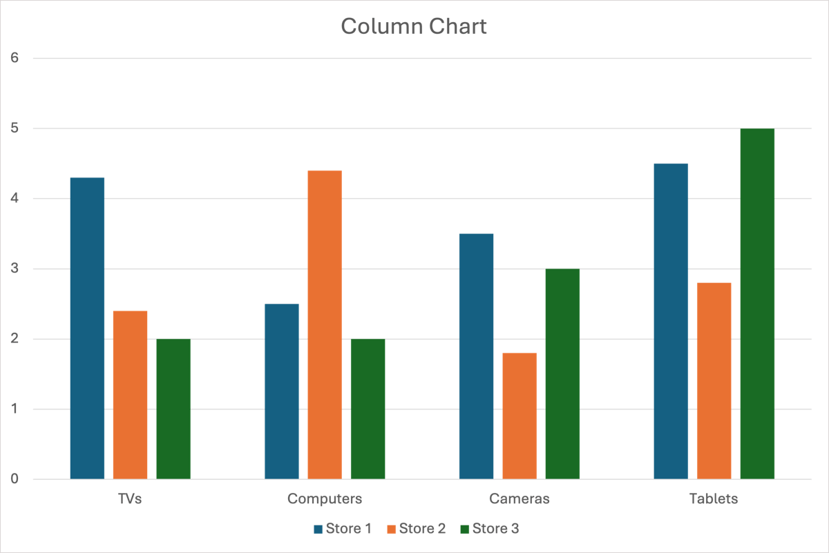
Column or bar chart: Compare quantities or categories where each column or bar represents the value like sales amounts or units sold at different locations.
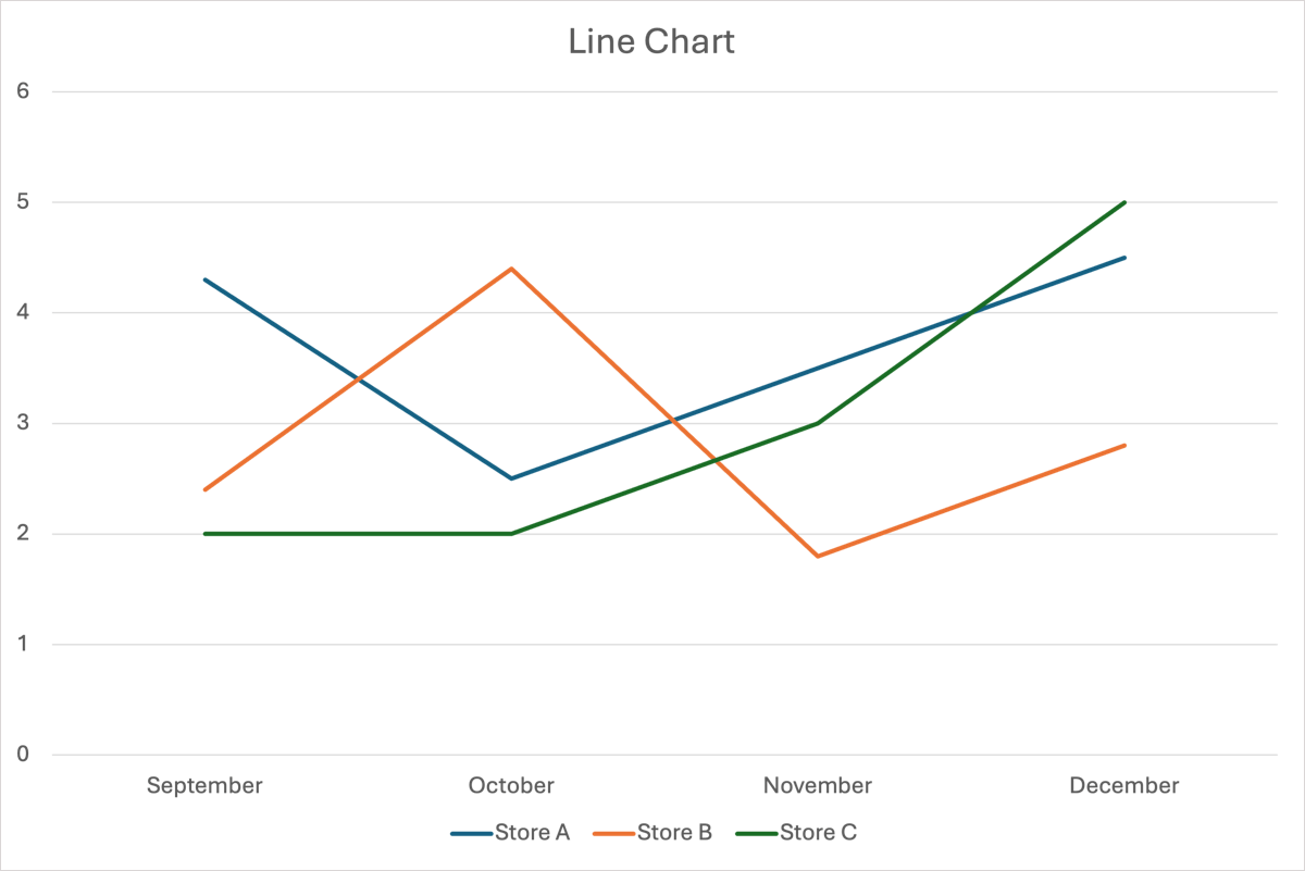
Line chart: Show changes or trends over time such as revenue or sales by month or quarter.
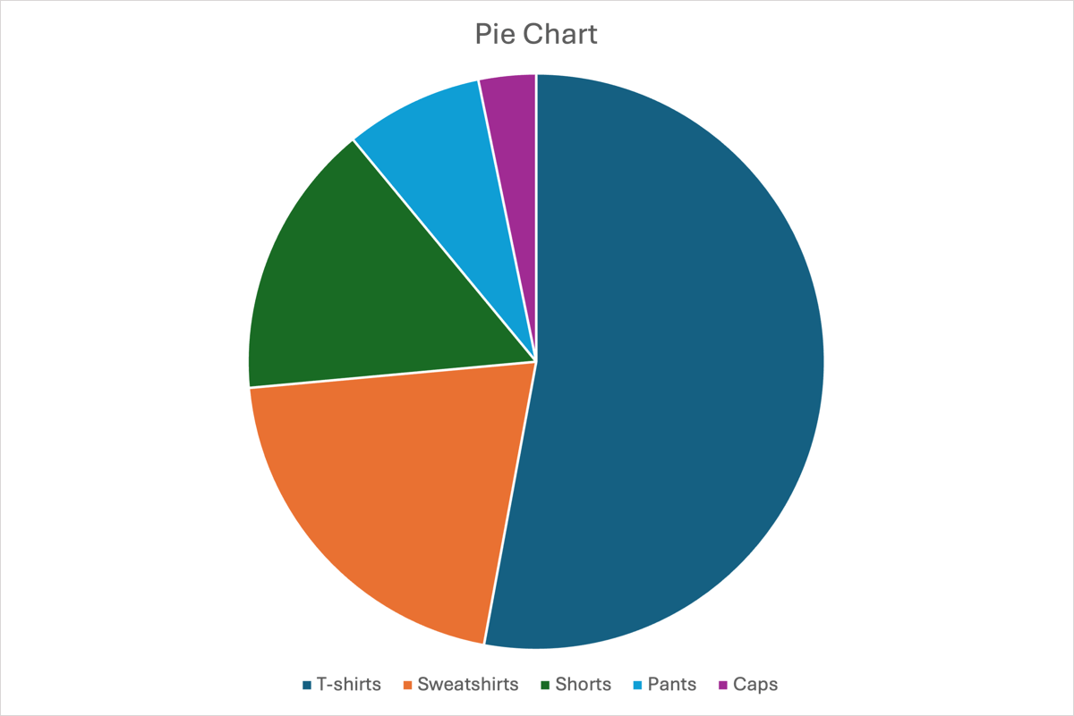
Pie chart: Display parts of a whole like sales by product for a location or expenses by type for a monthly budget.
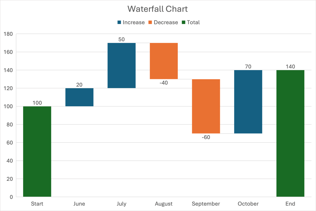
Waterfall chart: Show how a value changes over time because of a series of values using increases and decreases. Think of starting and ending balances with credits and debits or starting and ending amounts with shipments received and units sold.
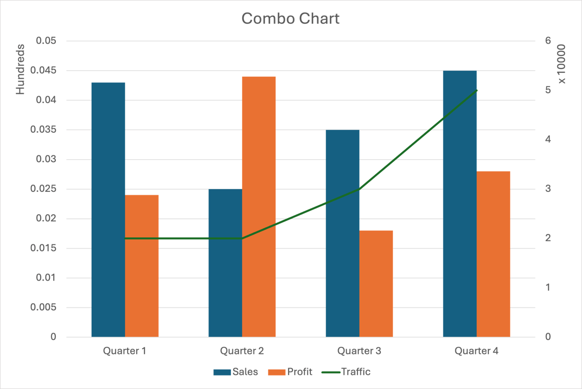
Combo chart: Combine two or more types of charts into one to compare categories, show trends over time, or identify relationships. Like in the example below, you can display sales and profit in a column chart with traffic amounts as a line graph.
You can also use area, funnel, and surface charts along with treemaps, histograms, and scatter plots, among others.
How to create a graph in PowerPoint
When you’re ready to create your graph, you’ll choose the type and then add the data using these steps.
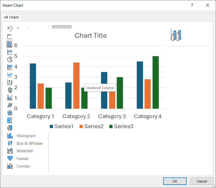
- Go to the Insert tab and select Chart in the Illustrations group. On Windows, this opens a pop-up window for you to choose the chart type. On Mac, this opens a drop-down menu for you to make your selection.
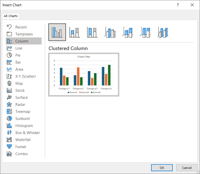
- Pick a chart type and then the variation of that type. On Windows, you can click a graph option to see a preview and then hover your cursor over that preview for a larger view.
- When you’ve made your choice, click OK to add the chart to the slide.
- You’ll then see an Excel spreadsheet pop open where you enter the data for the chart. It will have sample data that you can simply replace with your own. You can also add or remove rows or columns as needed.
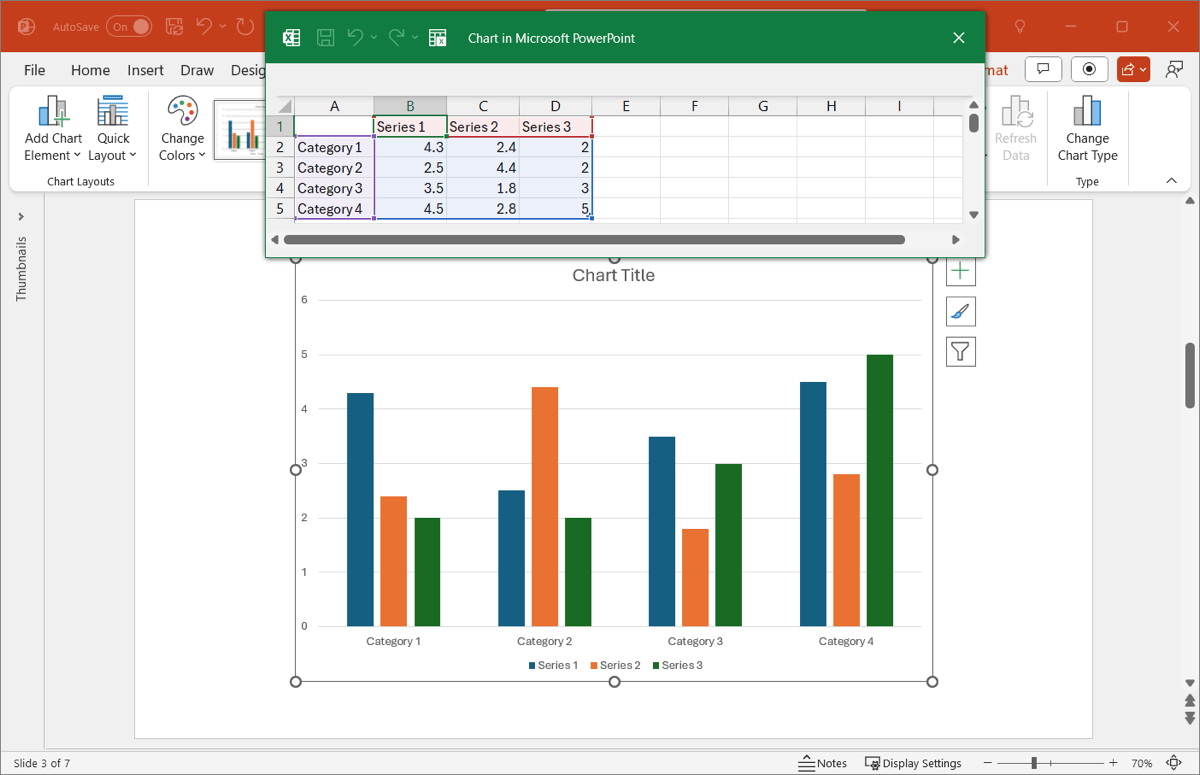
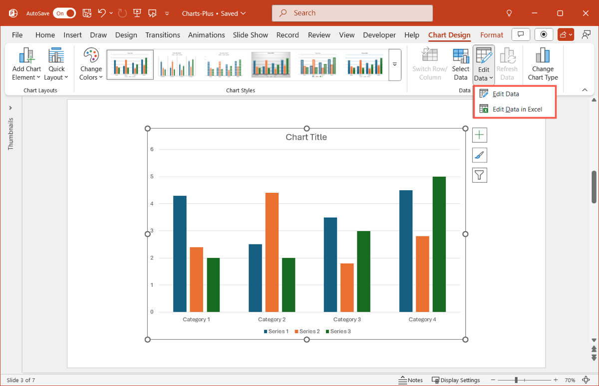
Close the spreadsheet when you finish working with the data. To reopen it for further editing later, select the chart, go to the Chart Design tab, and click Edit Data or Edit Data in Excel in the ribbon.
How to edit a graph in PowerPoint
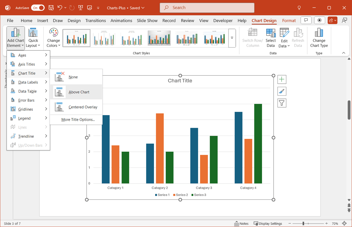
Inserting the graph and adding the data is only part of the chart creation process. Be sure that you include all of the necessary chart elements, like titles, labels, and a legend, choose a complementary color scheme, and pick a useful layout and optional style.
Chart Design tab: Add, remove, or position chart elements, pick a different layout, change the colors, apply a style, or change the chart type.
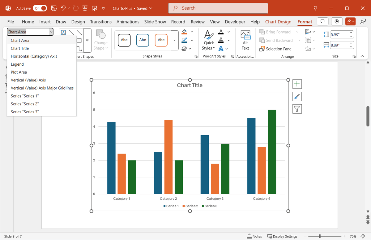
Format tab: Customize specific chart areas for shape and text colors, outlines, and effects, choose shape styles, or resize the chart.
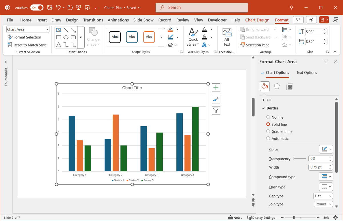
You can also right-click the graph and pick Format Chart Area to open the sidebar which allows you to customize a border, change the style for a series, and adjust the overlap or gap width.
How to create a graph in PowerPoint using AI
If you're looking for a quick way to get a graph, you should try using AI.
Using the Plus AI add-in, write a brief description of the slide and chart you want to create, and Plus AI will handle the rest. Best of all, both the chart and its description are fully customizable for complete flexibility.
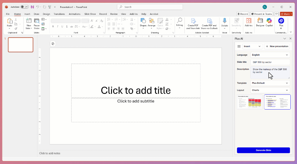
- With your presentation open, go to the Home tab and click Plus AI.
- Choose Edit with AI and then Insert for the new chart slide.
- Enter a Slide title and Description.
- Pick Plus Default for the Template and Charts for the Layout.
- Choose the chart slide style and hit Generate Slide.
You can then select the chart and use the Chart Design and Format tabs to customize it and the text inside the box to edit it.
Plus AI is a presentation add-in that works with Microsoft PowerPoint and Google Slides. Create new slideshows, edit existing ones, set up custom branding, generate images, and much more to make engaging and attractive presentations for any type of audience.
For more details and to start your free trial, visit the Plus AI website.
Conclusion
Graphs are fabulous for displaying data, and there’s no better place for one than in a slideshow that’s intended for visuals! You can easily add most any type of chart in PowerPoint, and if you use Plus AI to pop in your graph to save time, you can customize it like any other PowerPoint chart.
FAQs
Can I use AI to generate a chart in PowerPoint?
Yes, you can use the Plus AI add-in to create native PowerPoint charts using AI. Plus will automatically select a chart type and generate data for your chart.
How to draw a diagram in PowerPoint?
Similar to graphs, you can create diagrams using a built-in PowerPoint feature. Go to the Insert tab and select SmartArt in the Illustrations section of the ribbon. You’ll then see a variety of options like hierarchy and relationship diagrams along with flow charts and pyramids. Choose a diagram and click OK to add it to the slide.
How do you make an XY graph in PowerPoint?
One of PowerPoint’s graph types is an XY chart. Go to the Insert tab and select Chart in the Illustrations section of the ribbon. Choose XY (Scatter) on the left and then choose the variation you want to use on the right. Click OK to insert the scatter plot and then customize it like any other chart.
How do you make a moving graph in PowerPoint?
You can animate a graph in PowerPoint just like other slide elements. Select the chart and go to the Animations tab to set up the movement you’d like. Just make sure that you don’t overdo it with the animations. You want to make sure the graph remains readable and usable for your audience.